Steal my portfolio: How I structure my portfolio preview including FREE Figma Template!
A behind-the-scenes look at the portfolio structure that usually gets me in the door.
If you’ve been a subscriber for a while you’ll see that I love to bang on about the importance of having not just one, but two portfolios. (If you don’t know what I’m talking about then check out this post, and this one).
You've heard the whole spiel on why having two portfolios is the golden ticket to landing interviews. But you're probably wondering, "What should my very first portfolio even look like?" Good news! Today's your day. I'm handing you a Figma template to kick things off. But before we dive in, let's break down the structure of my portfolio and why I've chosen to organise it this way.
Slide 1: The cover page
This may seem obvious but, the first slide is the first thing people are going to see when they crack open your PDF or presentation. No need to go all out—just your name, what you'd call this file (I like to call it 'Portfolio Preview'), and the date will do.
Feel like jazzing it up with some visuals? Go ahead. I've got a personal brand, so I use those predesigned elements. You could sprinkle in some UI elements if you like, but I personally steer clear of showcasing work on the initial slide as I’d rather warm people up to that.
Slide 2: An introduction
This slide is your intro spot. Given it's a 16:9 slide, you're working with limited screen real estate—which is actually great, because it keeps you from rambling on.
I like to pop a photo of myself here. I get that some folks are iffy about photos, but look, a quick Google or LinkedIn search would reveal my face anyway, so why not include it? If you're not into photos, consider an illustration or graphic that gives a glimpse into who you are.
For the text, I aim to keep it short and distinct from your run-of-the-mill Product Design portfolios. Let's face it, every designer claims to be passionate. Try a headline that breaks the mould. Not a wordsmith? ChatGPT can lend a hand.
The best advice I ever got from an editor? Write the way you talk. Forget all that formal, professional tone you were taught in school. You'll just blend into the crowd. This is your chance to show your true self.
I also like to include logos of companies I've collaborated with. They don't have to be household names; it's about showing the scope of your experience. If you're still on the hunt for your first gig, consider badges that highlight your achievements—like 'Graduated in 2020,' for example.
So, have fun with these slides and give some thought to the visual design. What feels engaging or exciting to you? Go with that.
Slide 3: Your experience
I can't stand CVs. Writing them, reading them—it just feels like they miss the mark in the design world. So I go rogue and opt for a more laid-back version in my portfolio preview.
Now, let's dig into the specifics. On this page, I list the latest companies I've collaborated with, my role there, and the timeline. I keep it brief on purpose—LinkedIn can fill in as a living CV, assuming you update it regularly (which I admit, I need to get better at).
I also lay out my skills on this page, sticking to key terms or phrases. This lets anyone reviewing my portfolio quickly gauge the breadth of my product design expertise.
Personally, I'm a fan of featuring testimonials from past clients or colleagues. Whenever I can, I aim to snag a testimonial or two. Not only does it add a layer of social proof and validate your experience, but it's also a nice pick-me-up for those moments of self-doubt.
If you're light on testimonials, no sweat. Reach out to tutors or educational institutions where you've studied and ask for one. Alternatively, you can showcase any positive feedback you've gotten in the past.
Slide 4: A project cover
Now that the hiring manager or employer has gotten a taste of who you are and what skills you bring to the table, it's your turn to wow them with your work.
I'm partial to dedicating a slide just to the logo of the company or project I've been involved with. If it's a self-initiated project, no worries—you can either whip up a logo specifically for it or simply use the project's name.
Slides like these might seem like filler, given they're so minimal. But here's the thing: if you're showcasing 5 or 7 projects in your portfolio, they can start to blur together. These 'breather slides' act like palate cleansers, aiding the flow and serving as navigational markers throughout your presentation.
Slide 5: The project details
Time to put your work in the spotlight! Stick to one slide here, keeping the format in the same vein as your intro or experience slides.
This is where you can flash some of your designs—be it the final UI (which tends to dazzle people with its polished look), a wireframe, or even smaller UI elements if it's a design system project. The choice is yours, but lean into what's visually compelling. Think Dribbble in its prime level of flair.
I often hear concerns like, "The project I worked on looks bland," or "The branding wasn't flashy enough." Listen, this is your portfolio—you call the shots on how you present your work.
If you feel like adding some razzle-dazzle to how the product actually appears in the real world, go for it. You can always elaborate on your design choices during the interview. To me, that's what a proactive, problem-solving designer would do—striving for improvement, rather than settling for what is.
Now, about the copy. Use this space to pique interest and stir curiosity. That means skipping yawners like, "Redesigning the onboarding experience for a bank." How about something punchier, like, "Boosting user retention by 100% with 4 key onboarding tweaks".
Next up, outline your specific contributions to the project. And please, drop the collective "we." Sure, design is often a team sport, but from a hiring standpoint, they want to know what YOU brought to the table. Save the group dynamics for the interview; this portfolio is your solo act.
Rinse and repeat for the next 3-4 projects.
Optional Slide
If you've got a wealth of projects to show off, you might be tempted to go overboard. But let's be real—no one wants to sift through a dozen similar slides. It's overkill and, frankly, becomes boring (and if you genuinely have 10 projects you're bursting with pride over, you probably don't need my guidance anyway).
Personally, as a freelancer, I have a select few projects that I want to highlight to showcase my diverse skill set. For these, I go for a more streamlined approach: a small visual tile, the client's name, and a brief project description. This way, I can cover a broader spectrum of my work without overwhelming the viewer.
End Slide: The Wrap-Up
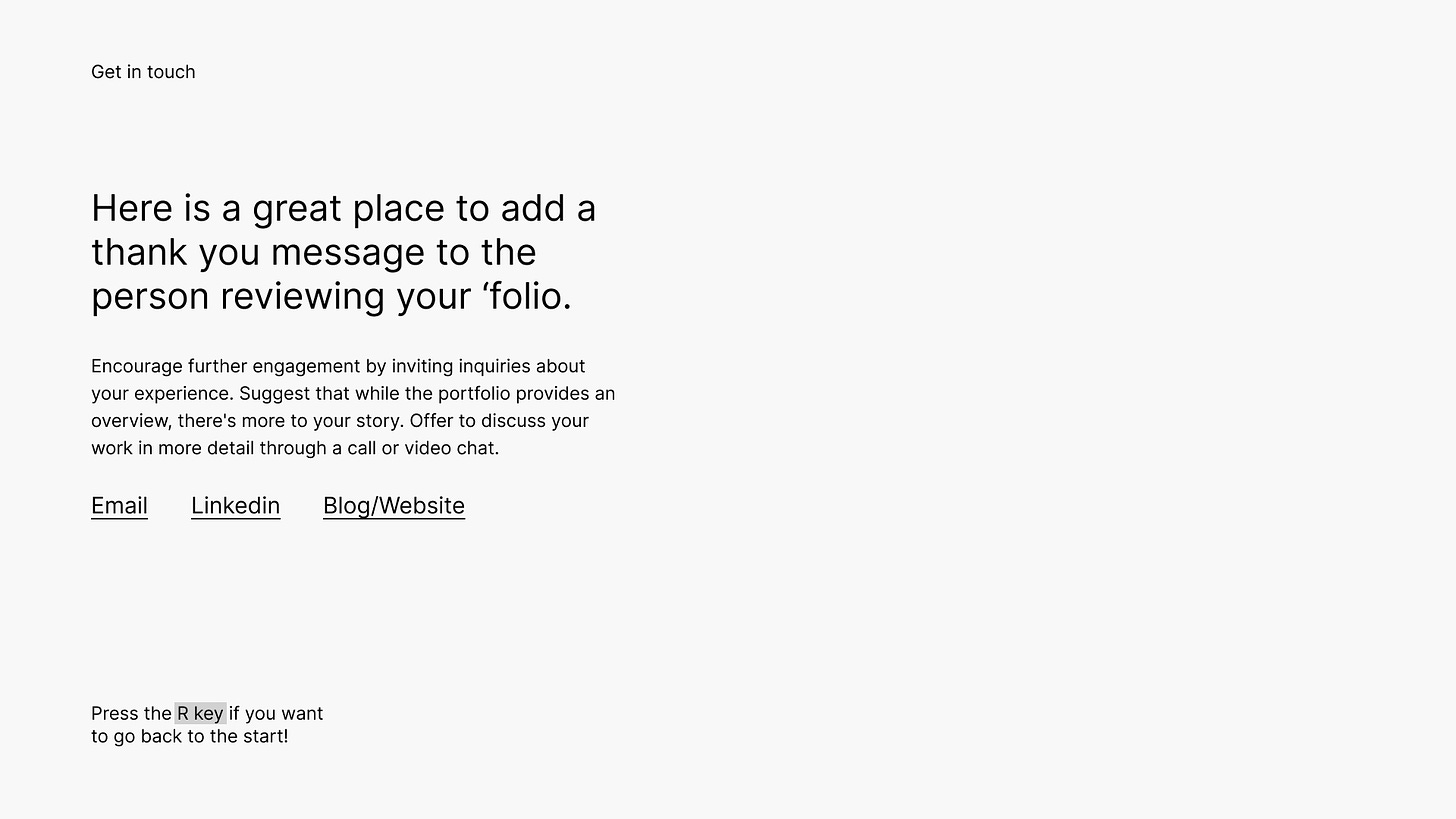
Closing out your portfolio presentation is a simple affair. Start by thanking the viewer for taking the time to reach the end. Follow up with essential contact details—your email, phone number, and LinkedIn profile. Double-check these details; trust me, I've had the wrong phone number on mine for a whole year!
Keep in mind, your portfolio might be shared beyond the initial recipient, so make sure all necessary contact info is included for those who may not have your original email or application.
Conclusion
I’m not going to guarantee that this folio format will secure an invitation to interview, as that’s a lofty statement. But I do guarantee that it’s much easier for you work create, update and tweak. So take the Figma file, fill in the blanks, experiment, and let me know how you get on. I’d love to see what you create!
For even more inspiration check out bestfolios.com and foleo.design.
Grab the Free Figma Template 👇🏻
Are you going to try and use this template? Got any questions or need any help, let me know!
Enjoy this post; I think others might too?
Please support me by sharing! You can refer them to subscribe to my newsletter. If you have any questions or fancy a chat? Email me at liz@skyburgerstudio.co.uk or send me a message on Linkedin.
Want to have a mentoring session with me?
Book your slot here on APDList for a 30minute mentoring session.


Hey Liz, love this post. I saw it on Reddit, and find it very useful. I'd like to quote it in one of the blog post I'm writing for www.woodyjobs.com (job board for product designers). Are you okay with that?
Thank you!
This is great resource!